Oct 12, 2026 · @SofiaAndrew
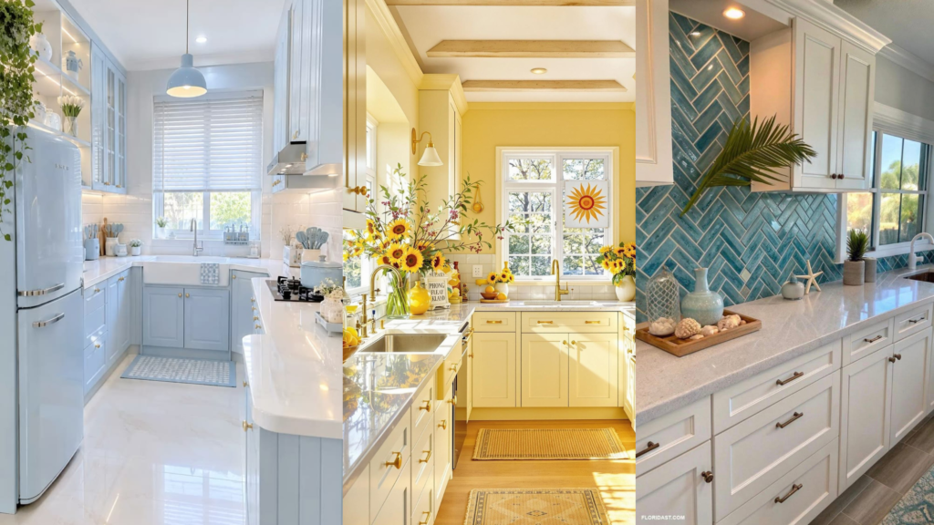
I wanted my kitchen to feel like a quiet morning at the beach, and I wanted it to survive a week of real family life like a Coastal Beach Kitchen Colors Ideas That Actually Work in a Real Family Home. It took me one painted wall, two wrong paint samples and a lot of fingerprints to learn that those two goals can live together.
How It All Started (Coastal Beach Kitchen Colors)
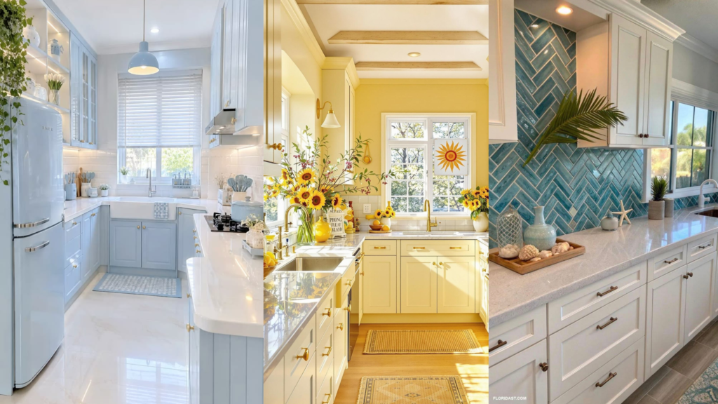
Every photo I saved on Pinterest looked the same: bright white cabinets, pale blue walls, sunlight spilling over a perfectly empty countertop. I stared at those pictures for months. Then I looked up from my phone at my own kitchen, with its backpacks on the stools, juice rings on the counter and a dog bowl by the door, and I thought, “Can a kitchen like that really exist in a house like mine?”
It can. But not the way the photos make it look. I made a few mistakes along the way, so you don’t have to. In this post I’m sharing exactly what I learned, which coastal colors worked, which ones didn’t, and how to get that calm seaside feeling in a kitchen that actually gets used every single day.
What I Got Wrong at First
My first attempt was a disaster, and I’m glad I can laugh about it now. I picked a pure, bright white for the cabinets because that’s what “coastal” meant to me. In the store it looked fresh. In my kitchen, under my yellow lights, it looked cold and a little like a hospital. And within two weeks, every handprint in the house had found its way onto it.
My second mistake was choosing a baby blue for the walls from a tiny paper sample. On the wall it turned out much brighter and more childish than I expected, and it fought with everything else in the room.
Here is what those two mistakes taught me:
- Pure white is harder than it looks. It shows every mark and can feel cold in rooms with warm lighting.
- Small samples lie. Colors change a lot once they cover a whole wall.
- Light matters more than the color name. A kitchen facing north looks different from one facing south, and morning looks different from evening.
The Coastal Colors That Actually Worked
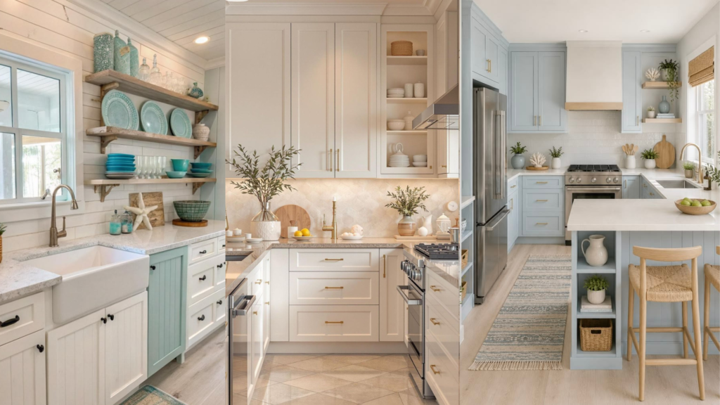
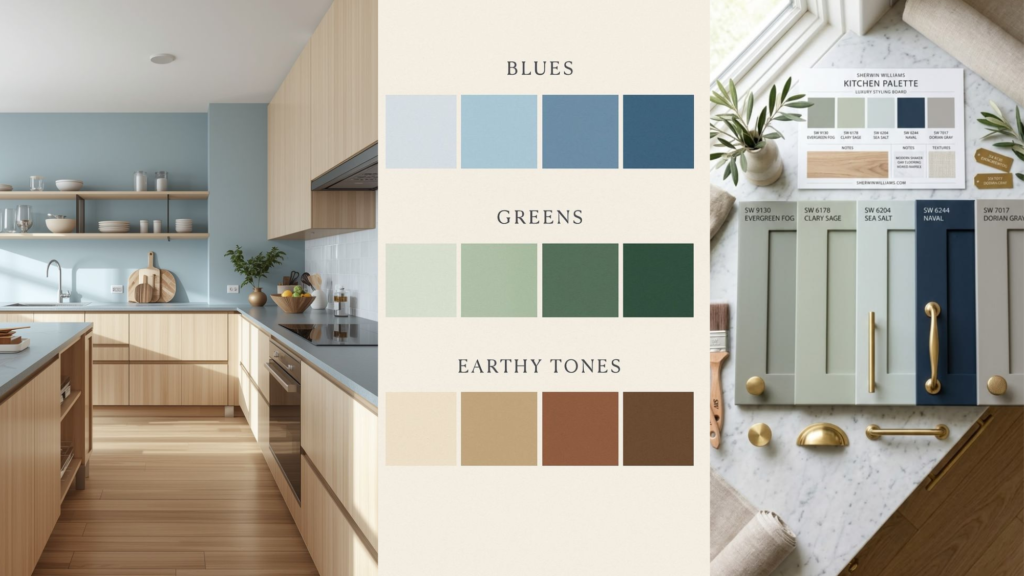
After repainting (yes, I did it twice), I found a handful of colors that gave me the beach feeling without the stress. Here they are, with the honest reason each one works in a busy home.
| Color | Where I used it | Why it works for a family |
|---|---|---|
| Warm white or soft cream | Cabinets and trim | Looks bright but hides smudges far better than stark white |
| Sandy beige or greige | Walls | Feels like warm sand, goes with every other color, never looks dirty |
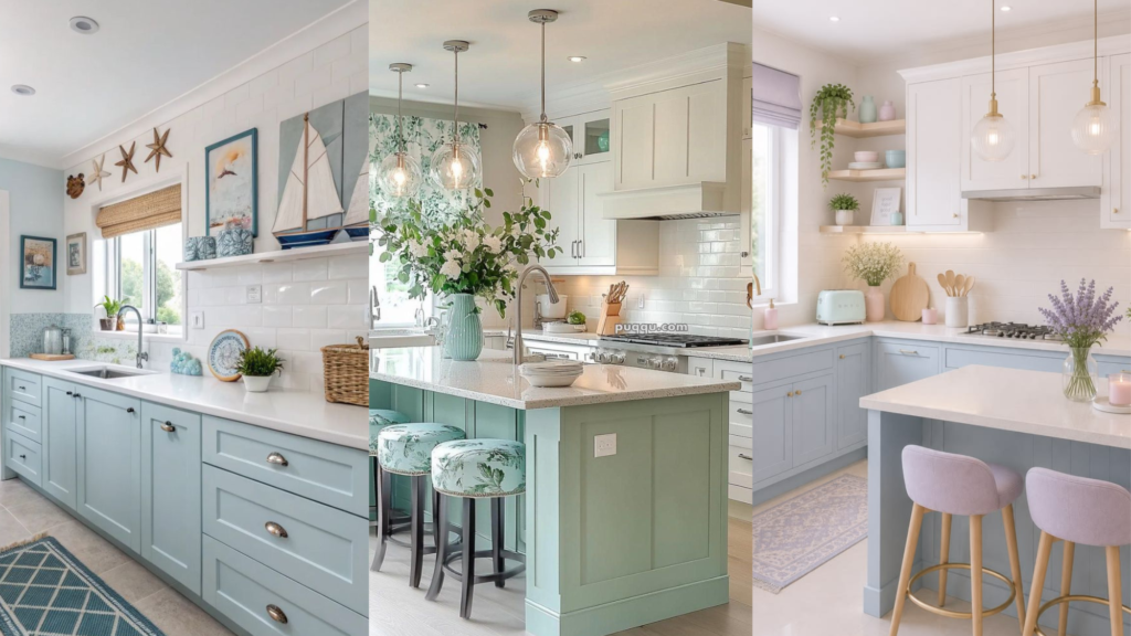
| Dusty or misty blue | Island or lower cabinets | Calm and soft, and the base of a cabinet hides scuffs |
| Sage or seafoam green | Backsplash or accent wall | Brings in the sea feeling without being too bright |
| Navy | Small touches like stools or a pendant | Adds depth and hides spills on things that get touched a lot |
| Natural wood | Shelves, stools, cutting boards | Warms up the cool colors and ages beautifully with wear |
My Favorite Combination
If I had to pick one formula, it would be warm white + sandy neutral + one soft blue or green + natural wood. That’s it. Four things. The kitchen feels light and airy, but it also feels warm, and nothing looks ruined when someone drags a chair across the room.
A Few Colors I’d Think Twice About
- Bright turquoise on a large area. It’s gorgeous in a vacation rental, but it can feel loud when you live with it every day.
- Pure bright white everywhere. Fine as an accent, tiring as the only color.
- Very dark colors on every cabinet. They show dust, crumbs and water spots quickly.
How I Made It Family-Proof
The color is only half the story. These small choices made the biggest difference in daily life.
- Pick a washable finish. I used a satin or semi-gloss finish on cabinets and a scrubbable matte or eggshell on walls. Flat paint looks pretty but marks easily, and wiping it can leave shiny patches.
- Test big samples, in real light. Paint a large patch, or a sample board, and look at it in the morning, at noon and at night before you commit. Move it around the room.
- Keep the busiest surfaces forgiving. Lower cabinets, the island and the area around the sink take the most abuse. Mid-tone colors like dusty blue and sandy beige hide the most.
- Use the 60-30-10 idea. About 60 percent soft neutral, 30 percent a secondary color like blue or green, and 10 percent a bold accent like navy or a bright vase. It keeps the room balanced without much effort.
- Add texture, not just color. Woven baskets, a jute rug, linen curtains and wooden stools give a coastal feeling and hide wear far better than flat colors do.
- Repeat colors. If blue appears on the island, in a bowl and on a dish towel, the whole kitchen feels planned, even when it isn’t perfectly tidy.
My Final Kitchen and What I’d Tell You
My kitchen today has warm white cabinets, sandy beige walls, a soft dusty blue island, a sage green backsplash and wooden stools. The navy is just one pendant light and a few dish towels. It isn’t perfect. There are still crumbs, and the dog still leaves paw prints. But when I walk in on a slow morning, with the sun on the cabinets, it truly feels like a little beach escape.
If you’re planning your own coastal kitchen, here is what I’d say to you as a friend:
- Start with a warm, soft neutral, not a stark white.
- Choose one calm blue or green and let it be the star.
- Add wood and natural textures to make it feel lived in.
- Test everything in your own light before you buy the paint.
- Remember that a kitchen is for living in, and a few marks mean it is loved.
Your kitchen doesn’t have to look like a magazine to feel like the beach. It only has to feel like home, and a good palette makes that much easier. If you try any of these ideas, I’d love to hear how it turns out in the comments.